The simplest way to choose between warm and cool metals is to look at the effect you want, not to ask which color your skin is supposedly allowed to wear. Warm-toned metals can make a look feel luminous, earthy, soft, ceremonial, vintage, or deliberately rich; cool-toned metals can read crisp, graphic, industrial, quiet, icy, or sharply modern. Neither category belongs to a particular complexion. The more useful question is what happens when the jewelry meets your clothing, surrounding colors, scale, surface finish, and actual light.
That makes warm vs cool metals jewelry less of an undertone test and more of a visual choice. A polished yellow-toned surface can behave very differently from a muted brushed one. A dark oxidized piece may read more neutral than a mirror-bright pale metal. A tiny warm detail can disappear against a camel jacket while the same detail becomes vivid on cobalt. Color is only one variable.
What warm, cool, and neutral metal colors actually do visually
Warm metal jewelry usually refers to jewelry whose visible surface leans toward yellow, champagne, bronze, copper, rose, or related warm hues. Those colors often echo earth tones, warm leather, tortoiseshell, cream, rust, burgundy, olive, and many brown or amber details in clothing. Against cooler fabric, the same warmth can become a deliberate point of contrast.
Cool metal jewelry usually describes surfaces that appear silver, white, gray, gunmetal, blue-gray, or otherwise visually cool. These tones can reinforce black, charcoal, cobalt, navy, icy pastels, and cool hardware, but they can also create useful tension against beige, brown, orange, or red.
Neutral-looking metals sit somewhere between those poles. A pale champagne surface, softened gray, antiqued finish, or metal with both warm and cool reflections may resist a simple label. That ambiguity can be useful: neutral-looking pieces often connect different colors in an outfit without becoming the dominant temperature.
Most importantly, warm and cool describe what you can see. They do not tell you what a piece is made from. A yellow appearance does not prove solid gold, vermeil, or any particular plating. A pale appearance does not prove silver, steel, or the absence of nickel. Color also cannot establish durability, sensitivity, value, coating thickness, or care requirements. Those facts have to come from reliable construction information for the specific piece.
Start with mood before you start with undertone
If you are deciding between gold or silver jewelry, try naming the mood of the outfit first. This removes a surprising amount of confusion.
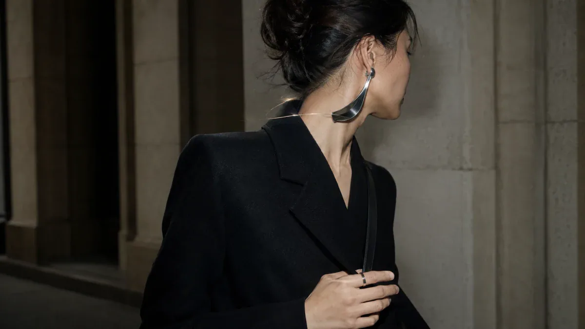
Imagine a black jacket with a strong shoulder and almost no decoration. A bright cool-toned earring may sharpen the architecture and make the look feel more graphic. A softly brushed warm-toned earring could instead introduce warmth and make the same jacket feel less severe. Neither answer is more correct; each changes the emotional temperature.
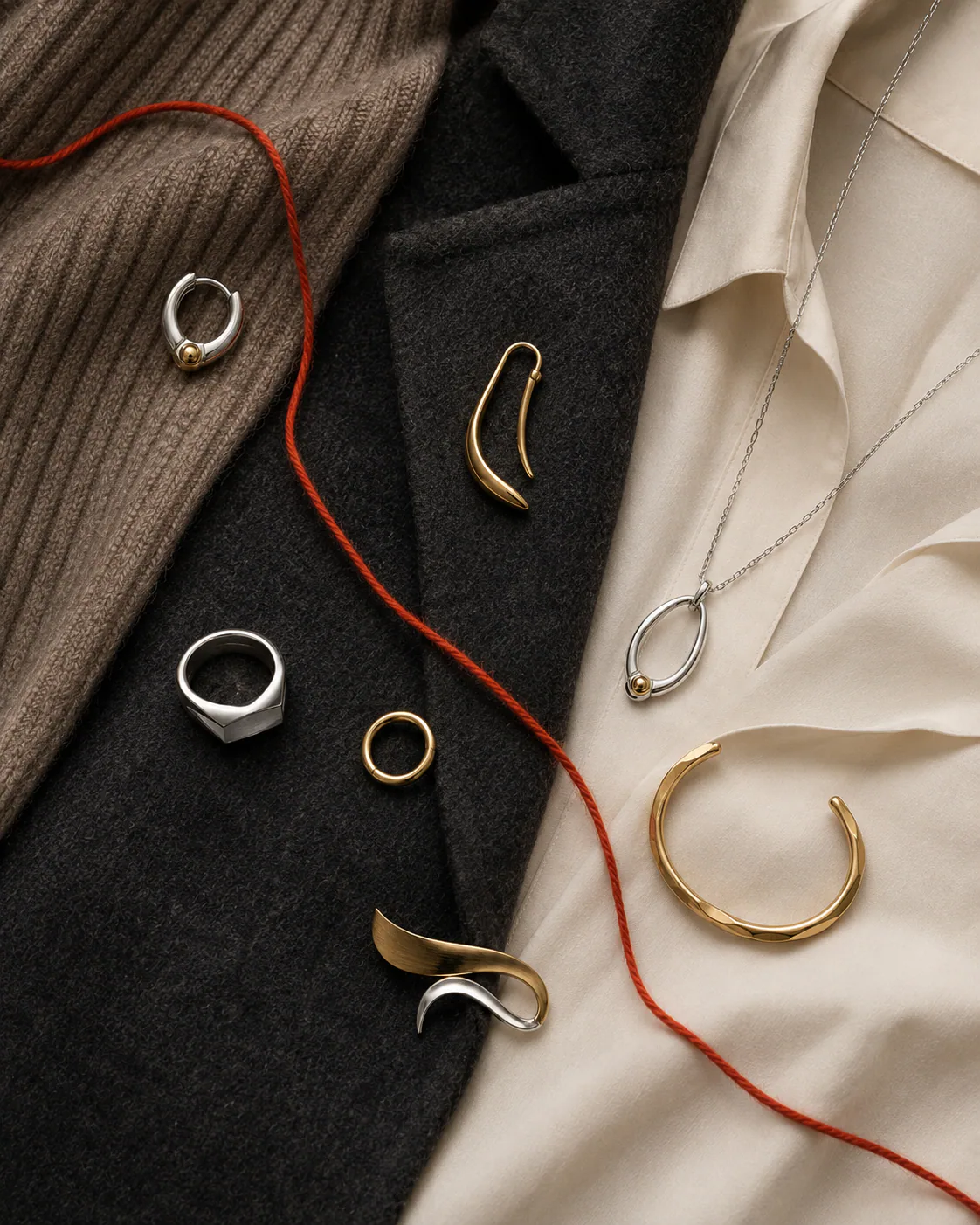
The same applies to softer clothes. An ivory knit with warm metal can become tonal and glowing. Add cool metal and the separation becomes clearer. With saturated color, warm metal may intensify some reds and greens while cool metal may pull attention toward blue or gray notes. Rather than searching for a universal pairing chart, notice whether you want harmony or interruption.
Jewelry metal undertone is only one part of the picture
The idea of jewelry metal undertone can be useful when it describes a visible hue. It becomes less useful when it turns into a biological rule about the wearer. Skin is not a flat color card. It changes with daylight, artificial light, surrounding fabric, makeup, hair, shadow, camera processing, and even reflected color from nearby walls.
That is why rigid prescriptions for warm skin tone jewelry and cool skin tone jewelry tend to collapse in real life. Someone may prefer a close tonal relationship one day and a strong temperature contrast the next. Both can be visually coherent.
If you enjoy undertone analysis, use it descriptively rather than restrictively. Ask whether the metal merges gently with the visible skin or separates from it. Then decide which effect supports the outfit. Contrast is not a mistake; sometimes contrast is exactly what gives a small piece enough presence.
Finish can change the temperature more than you expect
A metal color never appears independently from its surface. Finish controls how much environmental light enters the composition.
Polished surfaces behave like small mirrors. They can pick up blue sky, warm walls, black clothing, skin, windows, screens, and the surroundings. A warm-colored polished surface may suddenly carry cool reflections. A pale polished surface can absorb warm skin and interior light.
Brushed or satin surfaces scatter reflections, so the base color often reads more consistently. They can appear quieter, softer, and less jewelry-like in the conventional glossy sense. This makes brushed surfaces useful when you want color temperature without maximum shine.
Muted surfaces reduce the visual insistence of both warm and cool tones. They often integrate more easily with textured fabrics and casual clothing because the eye is not dealing with a bright specular highlight at the same time.
Bright surfaces increase separation. A small highly reflective form can carry more visual weight than a larger matte one, which is why comparing jewelry only by dimensions can be misleading.
Oxidized or intentionally darkened areas introduce another variable. Dark recesses can make highlights look brighter and can push an otherwise cool or warm piece toward a more neutral, graphic reading. Again, check the actual finish description rather than assuming how a dark surface was produced.
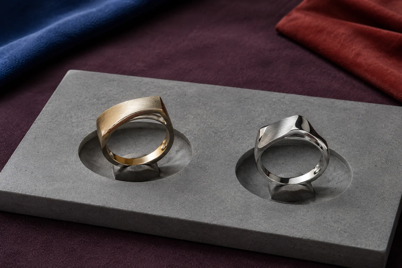
Mixed finishes can create contrast even when the visible metal color is similar. A polished ridge beside a brushed plane may be more noticeable than the difference between two metal colors of identical shine.
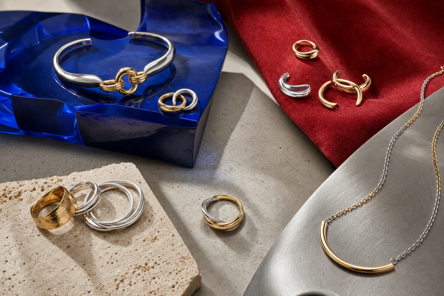
How to choose jewelry metal color in daylight
For anyone wondering how to choose jewelry metal color without relying on rules, daylight is the best first comparison because it makes surface differences easier to read.
- Wear the clothing you actually intend to pair with the jewelry.
- Stand near a window in indirect daylight rather than direct sun.
- Try the warm-toned option alone and look at the entire silhouette, not just the jewelry.
- Remove it before trying the cool-toned option. A clean comparison is easier than holding both beside your face at once.
- Step farther from the mirror. Notice which piece still has the visual weight you want.
- Move your head or hand so the surface catches several angles of light.
Ask what changed: Did one color disappear into the outfit? Did one become too bright? Did the jewelry sharpen the look, soften it, or create a useful interruption? Those observations tell you more than a static undertone chart.
Repeat the test under the light where you will actually be
Daylight is revealing, but it is not the only environment that matters. Warm interior bulbs can push nearly every reflective surface warmer. Cooler office lighting may make pale metals appear sharper and can reduce the warmth of yellow-toned surfaces. Restaurants, galleries, trains, elevators, shops, and nighttime streets all produce different reflections.
If you are choosing jewelry for a specific event, check it under a comparable indoor light before deciding. You do not need laboratory consistency. You are looking for whether the relationship survives the change: does the piece still separate from the clothing, retain enough detail, and create the mood you wanted?
Use wardrobe hardware as a clue, not a command
Zippers, buttons, bag fittings, belt buckles, glasses, watch cases, shoe hardware, and decorative fastenings already introduce metal-colored points into an outfit. Looking at them can help when the jewelry choice feels disconnected from the rest of the clothes.
You can match existing hardware for continuity, but you do not have to. A silver-toned zipper and warm earring can work precisely because the difference is visible. The useful question is whether the contrast appears repeated or purposeful rather than whether every metal-colored detail technically matches.
When hardware is small and scattered, it often behaves more like background texture than a styling rule. When it is large—a broad buckle, bright chain strap, or prominent fastening—it has more visual weight and deserves greater consideration.

Scale changes how warm and cool colors behave
A tiny warm stud and a broad warm cuff do not make the same statement. Larger jewelry creates more reflective area, so temperature, shine, and contrast become more visible. A color that feels subtle at the ear can become dominant when expanded across a necklace or wrist.
Before switching metal color, consider whether scale is actually the problem. If a cool-toned piece feels harsh, a smaller or more muted cool piece may solve the issue without changing temperature. If a warm piece disappears, increasing scale or choosing a brighter finish may provide the contrast you wanted.
This is especially useful with sculptural jewelry. Silhouette can dominate color. A large curved form may read first as shape, shadow, and negative space, with warm or cool temperature arriving only afterward.
A simple three-pass try-on method
When several variables are competing, use three passes instead of trying to solve everything simultaneously.
Pass one: color
Compare one warm and one cool option at approximately similar visual scale. Ignore the theory and record your immediate perception: softer, sharper, quieter, richer, brighter, more graphic, more integrated, or more contrasting.
Pass two: surface and scale
Now compare polish, brushing, darkness, width, and negative space. This often explains why you preferred one option. You may discover that the real preference was matte versus reflective rather than warm versus cool.
Pass three: construction reality
Once the visual choice is clear, return to the product information. Check the stated material, finish, dimensions, closure, care instructions, and any other construction details relevant to the piece. Never work backward from photography and assume the material because the color resembles something familiar.
What about mixing warm and cool metals?
Mixing warm and cool metals can be an excellent way to test which temperature you want to dominate, but it becomes a different styling question once both colors intentionally share the composition. For a quick experiment, choose one leading metal and introduce the other once in a smaller visual role. Look for a repeated curve, finish, spacing relationship, or body zone that connects them.
If you want to build a full mixed-metal system, continue with Switchroom’s dedicated Mixed Metal Jewelry guide or the step-by-step How to Mix Gold and Silver Jewelry. Those pages cover the subject in more depth without turning this warm-versus-cool choice into a mixing tutorial.
Common mistakes when choosing a metal color
- Treating skin tone as permission. A harmonious relationship and a contrasting relationship are both valid visual choices.
- Comparing color but ignoring finish. Bright polish, soft brushing, dark recesses, and texture can change the result dramatically.
- Judging under one bad light. Try daylight and the indoor environment where you expect to wear the piece.
- Ignoring scale. A large reflective area can overpower an outfit even when the hue itself works beautifully.
- Matching every piece of hardware automatically. Repetition can create coherence, but controlled contrast can be just as intentional.
- Reading material facts from photographs. Visible color cannot establish alloy, plating, coating, sensitivity, durability, or value.
The choice in one minute
Put on the outfit. Try one warm-toned piece in indirect daylight. Remove it and try one cool-toned piece of similar visual weight. Ask whether you want harmony or contrast, then inspect the finish and scale. Repeat the comparison under the indoor light that matters. Finally, check the construction facts from the actual product information.
If one choice makes the outfit feel more like itself, choose it. If the other creates exactly the interruption the outfit was missing, choose that instead. Warm and cool metal colors are not categories of people. They are tools for controlling light, rhythm, contrast, and mood.
Before you buy: separate color from construction
“Gold-colored” does not tell you whether a piece is solid gold, gold filled, vermeil, electroplated, or simply gold tone. The U.S. Federal Trade Commission distinguishes these descriptions and notes that plated surfaces wear according to factors including thickness and use.
Read the product material, base metal, finish, and care instructions rather than buying by color alone. Switchroom’s mixed-metal materials guide provides the brand’s material vocabulary, while the comparison of gold vermeil and gold filled explains why two warm-looking pieces can have different constructions and wear patterns.
Mixed metal jewelry is a bridge, not a compromise
Mixed metal jewelry is useful when you want warmth and coolness to coexist. It can show whether you enjoy a balanced temperature, a sharp interruption, or one dominant metal with a smaller counterpoint.
- Built-in bridge: one piece contains both metal colors, establishing the combination before you add anything else.
- Dominant plus echo: choose one primary metal across the largest pieces, then repeat the second metal once in a smaller ring, clasp, chain, or watch detail.
- Separated zones: place one metal near the face and the other on the hands, leaving enough distance and negative space for each to read clearly.
Avoid solving every mismatch by adding more jewelry. Sometimes the cleanest bridge is already in the garment: a gray knit between gold and silver, a pearl between warm skin and steel, or a black sleeve that allows both metals to detach from the body.
Care for the construction you own
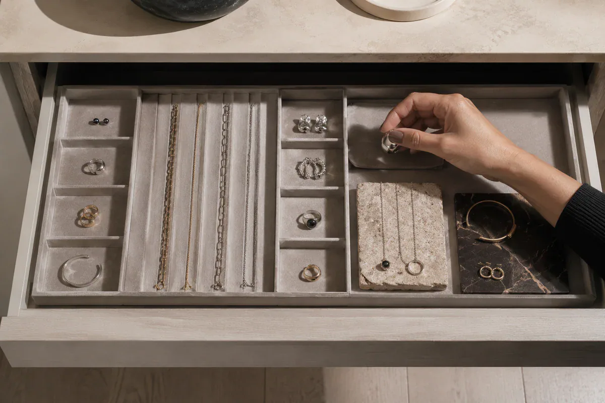
Care should follow material and setting, not the warm or cool category. The Gemological Institute of America advises that treatments, porous or organic materials, coatings, heat sensitivity, and stone settings can change what cleaning method is safe; ultrasonic cleaning is not appropriate for every piece. Store jewelry separately to reduce scratching, check the maker’s instructions, and use professional assessment when you do not know the stone, treatment, plating, or adhesive.
The final choice is not “Which metal am I?” It is “What should this piece do here?” Choose the metal that makes the silhouette, gesture, and mood more exact. Then choose a construction you understand and can care for.
Read next
- Mixed Metal Jewelry — the central Switchroom guide to building a deliberate relationship between two metal colors.
- How to Mix Gold and Silver Jewelry — a practical method using an anchor, bridge, hierarchy, repetition, and placement.
- Textured Metal Jewelry — a closer look at how hammered, brushed, polished, and darkened surfaces change visual character.
Sources & further reading
- Federal Trade Commission — Guides for the Jewelry, Precious Metals, and Pewter Industries
- The Metropolitan Museum of Art — Collection
- Victoria and Albert Museum — Jewellery collection
FAQs About Warm vs. Cool Metals
Is gold or silver jewelry better for warm undertones?
Neither is automatically better. Gold can create visual harmony with warmth, while silver can create a sharper contrast. Test similarly scaled pieces in daylight, your usual indoor light, and a real outfit, then choose the effect you prefer.
Can I wear cool metals with warm-colored clothing?
Yes. Cool metal against rust, camel, orange, or warm brown can produce a deliberate graphic contrast. Repeat the cool metal once in eyewear, a watch, a clasp, or another small detail if you want the choice to feel more connected.
How do I know whether mixed metal jewelry will work with my wardrobe?
Look at the hardware you already wear most: zippers, buckles, bags, watches, and glasses. A mixed-metal piece works especially well when it repeats both families, or when one metal remains dominant and the second appears as a controlled echo.
Should metal color or jewelry material matter more when buying?
They answer different questions. Color determines the immediate visual effect; material and construction affect labeling, wear, care, and value. Choose the color you want, but check what the piece is made from before purchasing.