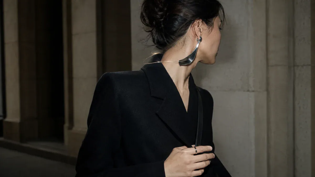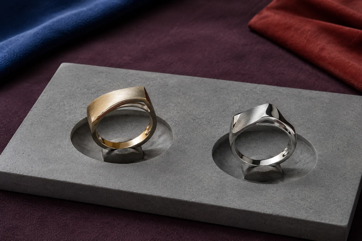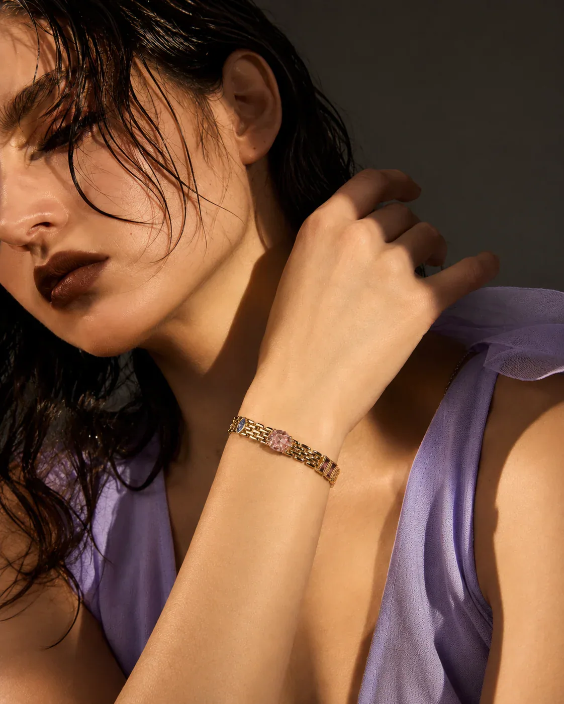
A narrow line of stones catches hard afternoon light beneath a charcoal bomber sleeve. A square steel watch sits nearby, but not touching; two sculptural rings repeat the bracelet’s cool metal without turning the wrist into a matching set. That is the central answer to how to style tennis bracelets now: treat the bracelet as a line in space, not as a symbol of formal dressing. This guide shows how to control width, gaps, metal repetition, sleeves, watch placement, and purchasing details so the result feels deliberate, current, and personal rather than inherited from a fixed occasion.
How to Style Tennis Bracelets by Proportion, Not Tradition
A tennis bracelet is visually simple: a flexible, continuous order of individually set stones. That simplicity makes proportion more important, not less. The bracelet can read as a fine glint, a graphic band, or a luminous line around the wrist depending on its width, setting, stone scale, and distance from everything beside it. The Gemological Institute of America notes that tennis bracelets range from slim strands to wider statement designs, with settings and metal choices changing both appearance and function. Its tennis bracelet buying guide is a useful factual reference; the styling interpretation below is Switchroom’s.
Begin by deciding what role the bracelet has in the full look:
- Fine line: a narrow bracelet acts like reflected light. It works beside a substantial watch, an architectural cuff, or a sleeve with visible volume.
- Primary band: a wider bracelet needs more empty wrist around it. Let it hold the visual field rather than automatically adding more sparkle.
- Connector: a bracelet in one metal can connect mixed-metal rings, earrings, or watch hardware when the same tone appears at least once elsewhere.
The modern move is rarely “add more because the bracelet is delicate.” Instead, enlarge the contrast. Pair a fine stone line with a broad shirt cuff, a dense knit, a matte leather watch strap, or one blunt ring. If the bracelet is already wide or highly reflective, reduce the number of neighboring pieces. One line of stones is enough when the clothing has strong architecture, the hand carries expressive rings, or the bracelet creates a clean flash against bare skin.
Build Tennis Bracelet Stacking Around Contrast
Tennis bracelet stacking looks current when each piece contributes a different visual function. Three near-identical rows can become a single undifferentiated block; a more articulate stack alternates light, surface, and weight.
Use the line–gap–anchor check:
- Line: choose one tennis bracelet as the brightest continuous element.
- Gap: leave a visible interval of skin, fabric, or shadow somewhere in the composition. Not every bracelet needs to touch.
- Anchor: add one contrasting form—a watch, rigid cuff, chain, cord, or materially different bracelet.
- Repeat: echo one metal tone in a ring or earring so the stack belongs to the whole body, not only the wrist.
Width contrast is usually more effective than quantity. A slim tennis bracelet beside a smooth medium-width bangle creates a readable edge. A wider stone bracelet can sit with a very fine chain, but adding another medium-width pavé piece may flatten the hierarchy. Texture also matters: faceted stones become sharper beside brushed metal, darkened silver, resin, leather, cord, or a polished surface with no stones.
For mixed metal bracelet styling, avoid dividing the wrist into a gold side and a silver side. Interleave the tones or use a bridge piece containing both. When no bridge piece is available, repeat each metal in a different location: for example, a white-metal tennis bracelet, a warm-metal watch detail, a warm ring, and a cool earring. The repetition makes the contrast feel intentional. Switchroom’s guide to why one signature style is overrated offers a broader identity-led guide for changing these relationships rather than fixing one permanent formula.
Pair a Tennis Bracelet With a Watch Without Crowding
A tennis bracelet with a watch works best when the two pieces are not competing for the same outline. First compare their visual mass. A large rectangular or sports watch can support a fine bracelet because the difference is clear. A small jewelry watch beside a similarly narrow tennis bracelet may look more conventional unless another element interrupts the symmetry—an oversized sleeve, a dark strap, a sculptural ring, or deliberate metal contrast.
Placement should follow movement as well as appearance. Try the bracelet on the hand side of the watch, then on the arm side. On many wrists, the arm side gives both pieces more stability; on others, a cuff or watch crown makes that placement uncomfortable. There is no universal correct side. The practical rule is to avoid continuous collision. If the bracelet repeatedly strikes the case, crown, or clasp, create space, move one piece to the opposite wrist, or choose a softer intervening element. This is less about etiquette than preserving the surfaces and making the stack quieter in motion.
Three useful watch pairings:
- Steel watch + warm-metal bracelet: repeat the bracelet’s warmth in one ring to make the contrast feel distributed.
- Leather-strap watch + stone bracelet: let the matte strap separate shine from skin; this is one of the easiest ways to reduce formality.
- Jewelry watch + tennis bracelet: keep one piece visibly finer, or introduce a fabric cuff so the two do not merge into a single decorative band.

Use Sleeves and Negative Space as Part of the Stack
Sleeves do not merely reveal jewelry; they edit it. A tennis bracelet half-hidden by a sleeve often feels less ceremonial than the same bracelet centered on a bare wrist. The interruption turns a continuous line into a flash, and the clothing gives the stones scale.
With a crisp shirt, allow the bracelet to appear just beyond the cuff rather than trapping it beneath the fabric. With a knit, use a slightly looser sleeve that can gather above the bracelet without catching on exposed settings. With a sleeveless look, create negative space through asymmetry: place the bracelet on one wrist and the visual counterweight—rings, watch, cuff, or bag hardware—on the other.
Material interaction matters. Prong settings can catch more easily than smoother bezel or channel constructions, so examine how the bracelet meets open-weave knits, lace, loose threads, and delicate linings. GIA describes bezel settings as surrounding stones with a metal rim and channel settings as holding stones between parallel metal strips, while prongs use small metal claws. That does not make one setting universally superior; it means the setting should match the wearer’s clothing, movement, and tolerance for maintenance.
A useful sleeve edit is to photograph the look with the arm relaxed rather than posed. If the bracelet disappears completely, move it closer to the hand or shorten the visible sleeve. If the wrist looks crowded in the photograph, remove one neighboring piece before changing the bracelet. The camera is good at revealing when “layered” has become visually compressed.
Buy for Construction, Fit, and Material—Not Just Sparkle
Modern tennis bracelet styling begins at purchase because flexibility, clasp scale, setting profile, and metal finish determine what the bracelet can do. Before buying, inspect five things:
- Fit: the bracelet should move slightly without traveling far up the forearm or slipping over the hand. GIA suggests using space for roughly one finger as a starting point, but comfort and bracelet construction still matter.
- Clasp and safety: check how the clasp closes, whether a safety mechanism is present, and whether you can fasten it reliably yourself.
- Setting profile: look from the side. A low, smooth profile behaves differently with cuffs and knits than elevated prongs.
- Articulation: the links should flex around the wrist without obvious kinks, sharp edges, or sections that turn over persistently.
- Material disclosure: read the actual metal and stone description rather than relying on color alone.
The U.S. Federal Trade Commission’s Jewelry Guides explain that sellers should accurately represent gemstone type, treatments, metallic content, quality, and related characteristics. For a commercial choice, ask direct questions: Is the stone natural, laboratory-grown, or an imitation? Is the metal solid, alloyed, plated, or vermeil? Has the gemstone been treated? What maintenance does the maker recommend? The right answer is not one material category for everyone; it is a description precise enough for you to judge value, care, and wear.
Review Switchroom’s materials overview and the deeper guide to why jewelry quality depends on material and construction before comparing pieces. When planning a full hand composition, browse sculptural rings as counterweights rather than searching only for matching bracelets.
Use this final buying-and-styling checklist in front of a mirror:
- Can you identify the brightest line immediately?
- Is there at least one visible gap or calm surface?
- Does one shape provide weight against the stones?
- Is each metal repeated somewhere else on the body?
- Can the wrist bend, type, carry a bag, and pass through a sleeve comfortably?
- Do the clasp, setting, stone type, and metal description match how you intend to wear and maintain the bracelet?
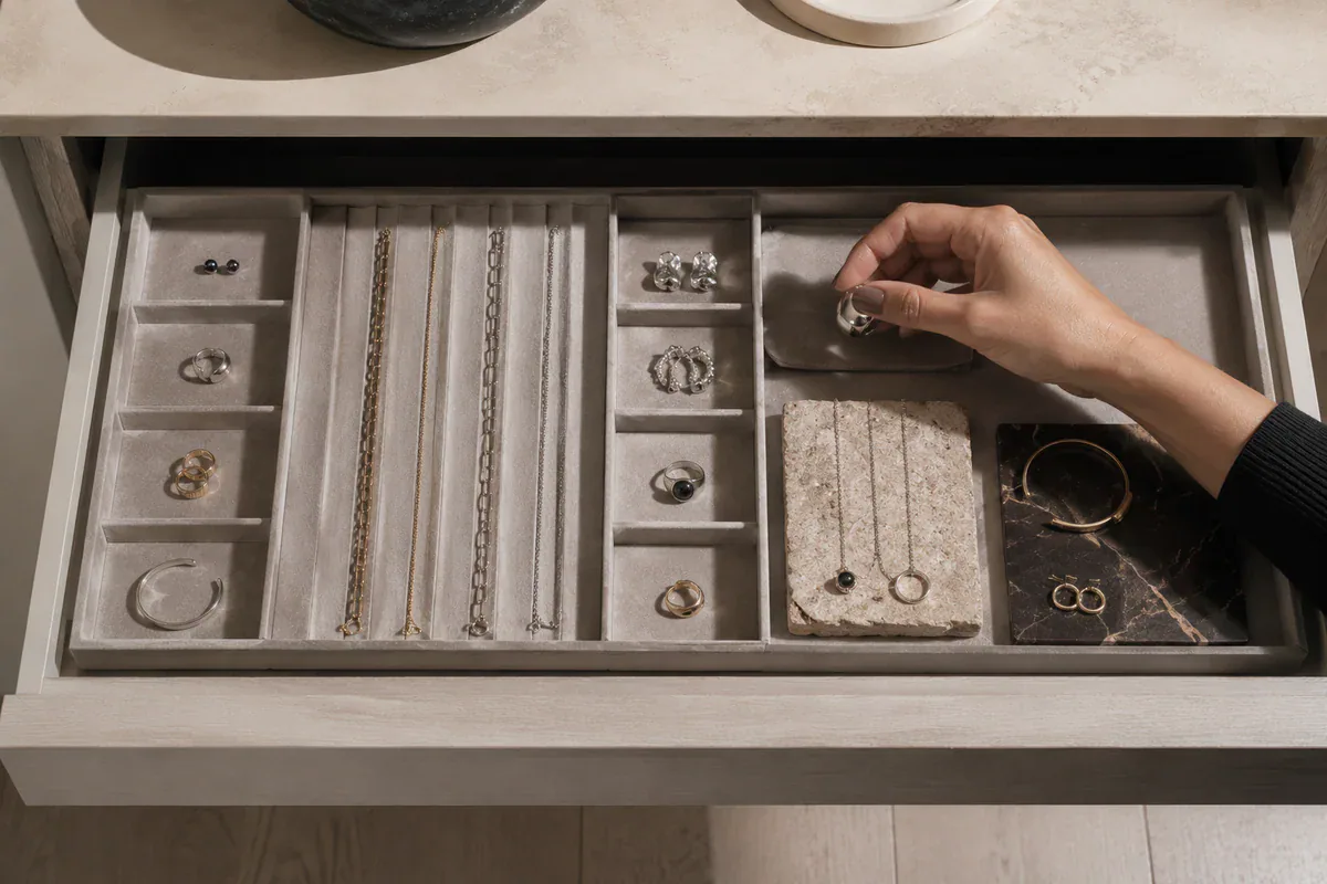
For care, follow the instructions for the exact stone, treatment, setting, and metal. GIA says many colored gems can be cleaned with warm water, mild dish soap, and a soft brush, but it also warns that chemicals, heat, treatments, and ultrasonic cleaning can affect different materials in different ways. Read its broader jewelry care guidance, then defer to the maker or a qualified jeweler when the piece contains plating, fragile settings, unknown treatments, or visible looseness. Store the bracelet in a separate box or pouch so it is protected from scratches and impact.
Frequently Asked Questions
Can I wear a tennis bracelet with a watch?
Yes. Keep the pairing modern by creating a clear difference in scale, surface, or metal tone, and leave enough space to prevent repeated collision between the bracelet and watch case.
Can I mix gold and silver with a tennis bracelet?
Yes. Repeat both metal tones elsewhere—through rings, earrings, watch hardware, or a bridge piece—so the mixed-metal choice reads as a complete composition rather than an isolated mismatch.
How tight should a tennis bracelet fit?
It should allow slight movement without sliding over the hand or traveling excessively up the arm. Space for roughly one finger is a useful starting point, but comfort, clasp security, and link construction should decide the final fit.
Is one tennis bracelet enough for an evening look?
Yes. A single line of stones can be strongest when the sleeve, neckline, rings, or bag already provide structure. Add another bracelet only when it contributes a different width, texture, or function.
A tennis bracelet becomes less traditional when it stops carrying the entire burden of “elegance” and starts participating in a larger spatial composition. Let it interrupt a sleeve, sharpen a watch, bridge metals, or stand alone against deliberate negative space. Explore the wider Switchroom jewelry collection or shop all pieces with line, weight, and movement in mind.