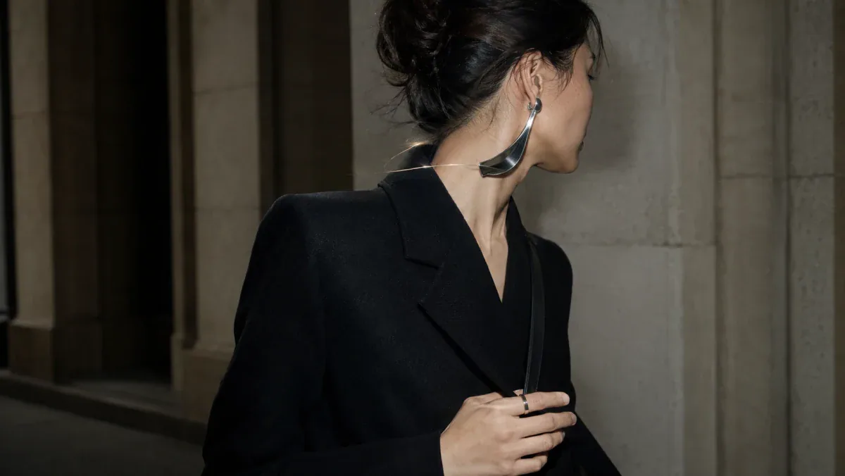
At the edge of a crowded square, a polished ear sculpture catches hard afternoon light while its wearer turns away from the camera. A ring flashes when they lift a bottle of water; a narrow enamel line appears only from one angle. Nothing spells out a complete biography, yet the look refuses invisibility. This is the promise of pride jewelry styling beyond rainbow merchandise: to build a visible, self-authored language through scale, color, placement, and movement—without asking one piece to explain everything about you.
Pride jewelry styling begins with legibility, not a palette
WorldPride Amsterdam 2026 runs from July 25 through August 8 under the theme of UNITY, with a program that includes marches, cultural events, a human-rights conference, and public gatherings. The official framing matters because it places celebration beside visibility, connection, and rights rather than treating Pride as a decorative season.
Color still belongs here. Cooper Hewitt notes that Gilbert Baker conceived the original rainbow flag in 1978 with fellow artists and friends. Respecting that collective symbol does not require reproducing it on every surface; an individual look can be more specific, partial, or difficult to summarize.
The fresh question is not “How do I wear every Pride color?” It is “How do I control what becomes readable, from which distance, and on whose terms?” Jewelry is unusually good at this because it works through proximity. A neck piece can shape the whole silhouette from across a room. An ear cuff may become clear only in profile. A ring can remain private until the hand enters conversation.
For a color-focused approach, Switchroom’s guide to wearing Pride color without neon explores restraint and material contrast. This article moves elsewhere: toward multiplicity, variable legibility, and the freedom to be read more than one way.
Visibility is not the same as total disclosure
The language of human dignity gives Pride styling a firmer foundation than seasonal marketing. Article 1 of the Universal Declaration of Human Rights begins from the principle that all people are born free and equal in dignity and rights. Jewelry cannot deliver rights, safety, or social recognition by itself. It can, however, participate in the everyday practice of appearing in public as a person who is not available for reduction.
That distinction is useful for LGBTQ jewelry styling. Visibility can be declarative, coded, intimate, protective, or changeable. A look may read clearly at a march and ambiguously at dinner; chosen family may notice a color while strangers see only a sculptural composition. You may want no coded meaning at all—only the freedom to wear something excessive, tender, severe, or strange.
None of these choices is more authentic than another. The point is authorship: you decide whether a piece acts like a banner, password, shield, joke, heirloom, or simply a piece you love.
This is why one fixed “signature style” can become limiting. The Switchroom essay on identity-switch accessories argues for a wearable archive rather than a permanent uniform. Pride makes that archive especially relevant: identity may be coherent without being visually identical every day.

A three-part pride jewelry styling formula
Use this practical formula when a look feels either too generic or too overloaded: signal, structure, switch.
1. Signal: decide what should be readable first
Choose one primary signal. It might be a saturated stone, an enamel edge, a substantial ring, an asymmetrical ear piece, a chain crossing the collarbone, or a brooch placed where a conventional lapel pin would not sit. The signal does not have to be colorful. Scale, shine, texture, and placement can communicate just as forcefully.
Ask one question: from three meters away, what should someone notice first? If the answer is “everything,” edit again. One dominant signal leaves room for the wearer.
2. Structure: give the signal an architectural frame
Structure comes from the relationship between jewelry and clothing. A strong ear piece needs space around the ear and neck. A large collar benefits from a clean neckline or deliberately conflicting strap. Stacked rings become clearer when the sleeve stops above the wrist. A brooch can interrupt a seam or sit near the shoulder instead of the heart.
Think in shapes rather than categories: circle against a sharp collar; long line against a bare shoulder; pearl irregularity against rigid metal. The Metropolitan Museum of Art describes rings as bodily adornment, identity expression, and works of invention. A small piece can reorganize the reading of the body.
3. Switch: include one element that changes by angle or context
The switch prevents the look from becoming a logo. Use a reversible pendant, movable charm, mismatched earrings, rotating ring, reflective surface, or color detail visible only in motion. Even a clasp can enter the composition when worn forward.
A supporting manicure may extend the switch through gesture, but it should not compete with the jewelry. One translucent nail, a narrow metallic edge, or a color interruption on the thumb can echo movement without turning the hand into a salon display.
- One dominant signal: the piece that establishes the first read.
- One structural relationship: the neckline, sleeve, seam, or exposed area that gives it space.
- One changing detail: something revealed by movement, proximity, or a second viewing.
- One restraint: a color, motif, or jewelry category you intentionally do not repeat.

Choose fit, material, and care for the actual day
Identity accessories still have to function on a body. Before buying or packing jewelry for a long public event, move beyond the front-facing product image.
Check proportion on your body, not only on the screen
For earrings, check dimensions and weight against your tolerance and piercing position. A long form may touch the neck or collar; a wide piece may interfere with glasses, headphones, or hair. Compare necklace length with your neckline. For rings, use the maker’s sizing method and remember that wide bands can fit differently from narrow ones.
Large does not automatically mean expressive, and small does not automatically mean subtle. A compact polished piece near the face may be more visible than a large dark piece against a patterned outfit. Test contrast, not just size.
Read the material description precisely
Do not treat “gold tone,” gold plated, gold vermeil, gold-filled, and solid gold as interchangeable. They describe different constructions and should be judged by the seller’s specification, your budget, expected wear, and care habits. Apply the same precision to silver-tone finishes, resin, enamel, pearls, stones, and mixed media.
Inspect the closure, too. A secure clasp, smooth interior, stable post, and fabric-friendly edge matter more than a dramatic photograph. Do not assume an unfamiliar material will suit your skin; read the disclosed composition and seek professional advice for known allergies or reactions.
Plan for heat, water, cosmetics, and storage
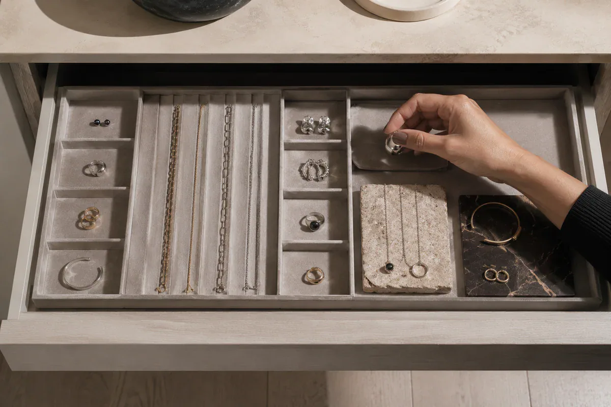
Follow the maker’s care instructions. Keep jewelry dry when possible, avoid swimming or showering in pieces unless designed for it, and put jewelry on after products have settled. Carry a soft pouch so removed pieces do not scrape against keys or one another. Wipe surfaces gently and store them separately.
Longevity is also an identity choice. A piece that can return for work, dinner, travel, or a quiet day after Pride has more expressive range than a piece designed for one photograph. Switchroom’s ethics and care principles emphasize limits, transparency, and fewer pieces with longer lives.
Style for context without dressing as a different person
A useful Pride look does not require the same intensity in every setting. Keep the core piece and change its supporting architecture.
For a march or outdoor public gathering
Prioritize secure closures, manageable weight, and pieces that do not catch easily on bags or other people. Let one high-visibility form lead: an ear sculpture, collar, brooch, or ring stack with clear silhouette. Use color where it remains legible in daylight rather than adding many small accents that disappear at crowd scale.
For a gallery, film event, or cultural program
Move the drama closer to the face or upper torso, where conversation happens. An asymmetrical ear composition, neck piece, or sculptural brooch can read like a small exhibition. Keep clothing quieter, but not necessarily neutral; the goal is spatial clarity, not minimalism.
For dinner, a date, or chosen-family gathering
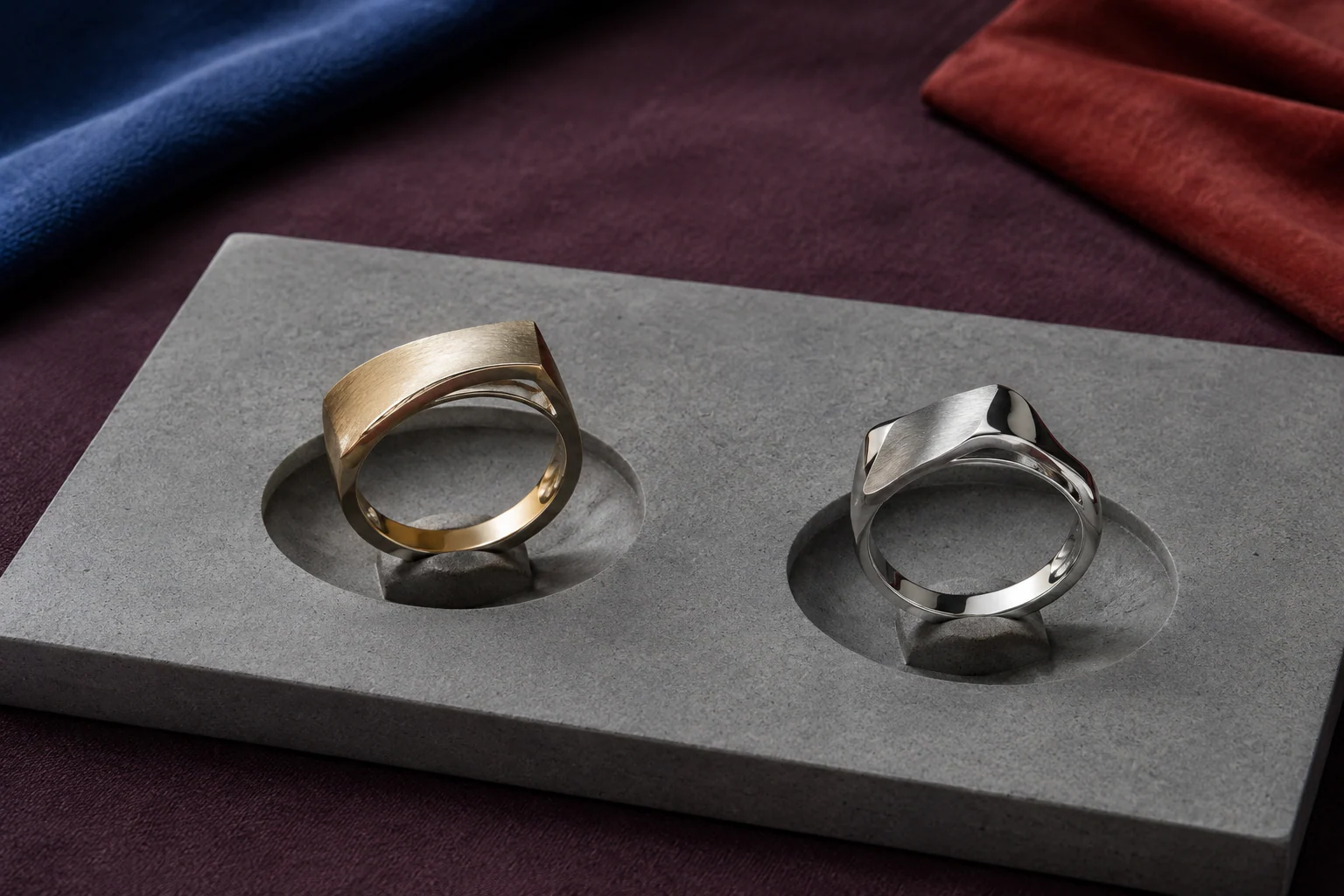
Choose pieces that reward proximity: a ring with an unusual side profile, a pearl with irregular surface, a small enamel interruption, or a chain detail that appears when a jacket opens. This is where self-expression jewelry can become intimate without becoming timid.
For a mixed or uncertain room
Use a switchable piece and decide in advance how visible you want it to be. A pendant can sit outside or inside a shirt. A brooch can move from chest to bag. An ear piece can be worn alone rather than as a pair. This is not a retreat from Pride. It is control over access.
When you are ready to explore pieces, browse the Switchroom jewelry collection by construction and silhouette rather than searching for a prewritten identity. For hand-led styling, the ring collection is a useful starting point because rings enter public view through gesture, touch, and movement.
Frequently asked questions
Does Pride jewelry have to use rainbow colors?
No. The rainbow is an important collective symbol, but personal Pride styling can also use form, scale, material, placement, or a single meaningful color. The strongest choice is the one you author rather than the one seasonal marketing assigns to you.
How can colorful jewelry avoid looking like costume?
Choose one dominant color piece, give it clear negative space, and avoid matching every accessory. Let metal, clothing, and skin create the structure around the color instead of repeating the same shade across the whole look.
What jewelry works best for a long Pride event?
Choose secure closures, tolerable weight, smooth edges, and proportions that work with your clothing, glasses, hair, and bag. Read the material and care information, and carry a soft pouch for any piece you may remove.
Can jewelry express identity without explaining it?
Yes. Jewelry can be public, coded, intimate, or simply pleasurable. You decide whether a piece acts as a declaration, a private reference, a changing detail, or a piece with no explanation attached.
Pride beyond the rainbow is not a rejection of collective symbols. It is an argument for a larger visual vocabulary. Wear the banner when you want the banner. Wear the strange ring, severe collar, soft pearl, bright enamel edge, or unreadable little piece when that is more truthful. The goal is not to become impossible to see. It is to remain impossible to finish in one glance.
Explore jewelry as portable architecture, and choose the next piece for the life it can keep entering—not only the event where it first appears.