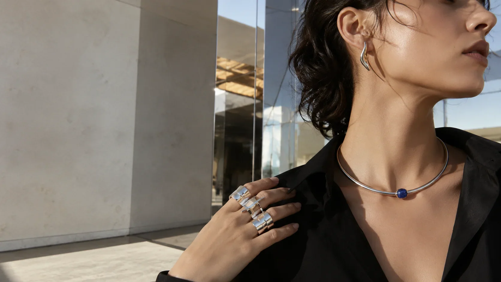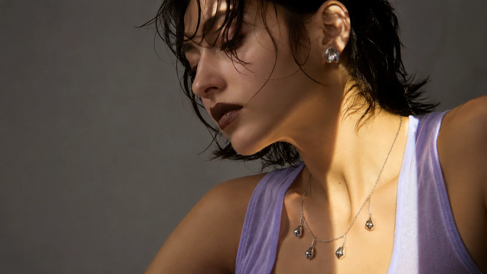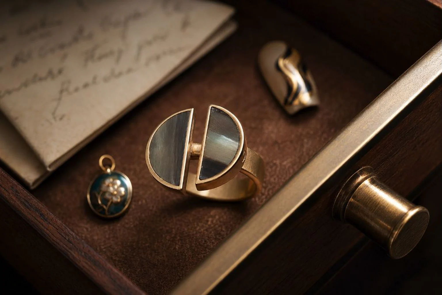
Fluid metal jewelry is easiest to recognize by what the form does before you notice what the surface does: the silhouette appears to sag, swell, fold or stream, while the metal itself remains solid. The defining effect comes from controlled volume, changing thickness, negative space and moving highlights. Texture can support that illusion, but texture alone does not make a piece look liquid.
\nThat distinction matters because a rippled surface and a genuinely fluid form behave very differently on the body. One catches light across a mostly fixed outline; the other changes the outline itself. Once you learn to separate silhouette from finish, it becomes much easier to judge a cuff, earring or ring—and to style one without turning your outfit into a theme.
Fluid form starts at the edge
\nLook at the outer contour first. If you reduced a piece to a black cut-out, would it still seem to be moving? Strong fluid forms usually answer yes. A broad fold may narrow into a neck, a rounded mass may pull away into an opening, or one side may feel as though gravity has stretched it before the metal suddenly stopped.
\nThis is why controlled asymmetry matters. A perfectly even loop can be beautiful, but it reads as geometry. A convincing liquid-looking volume often needs interruption: one side thickens, another thins, a curve changes speed, or a channel opens where you expected solid metal. The eye reads those shifts as a sense of motion.
\nReflection then completes the effect. On a polished or softly reflective surface, highlights should roll over the volume rather than break into dozens of unrelated sparkles. A broad highlight that stretches, narrows and disappears around a bend tells you more about the form than a field of decorative dimples ever could.
\n\nFluid metal jewelry versus textured metal
\nTexture lives on the skin of a piece. Fluidity lives in its body. That is the cleanest way to tell them apart.
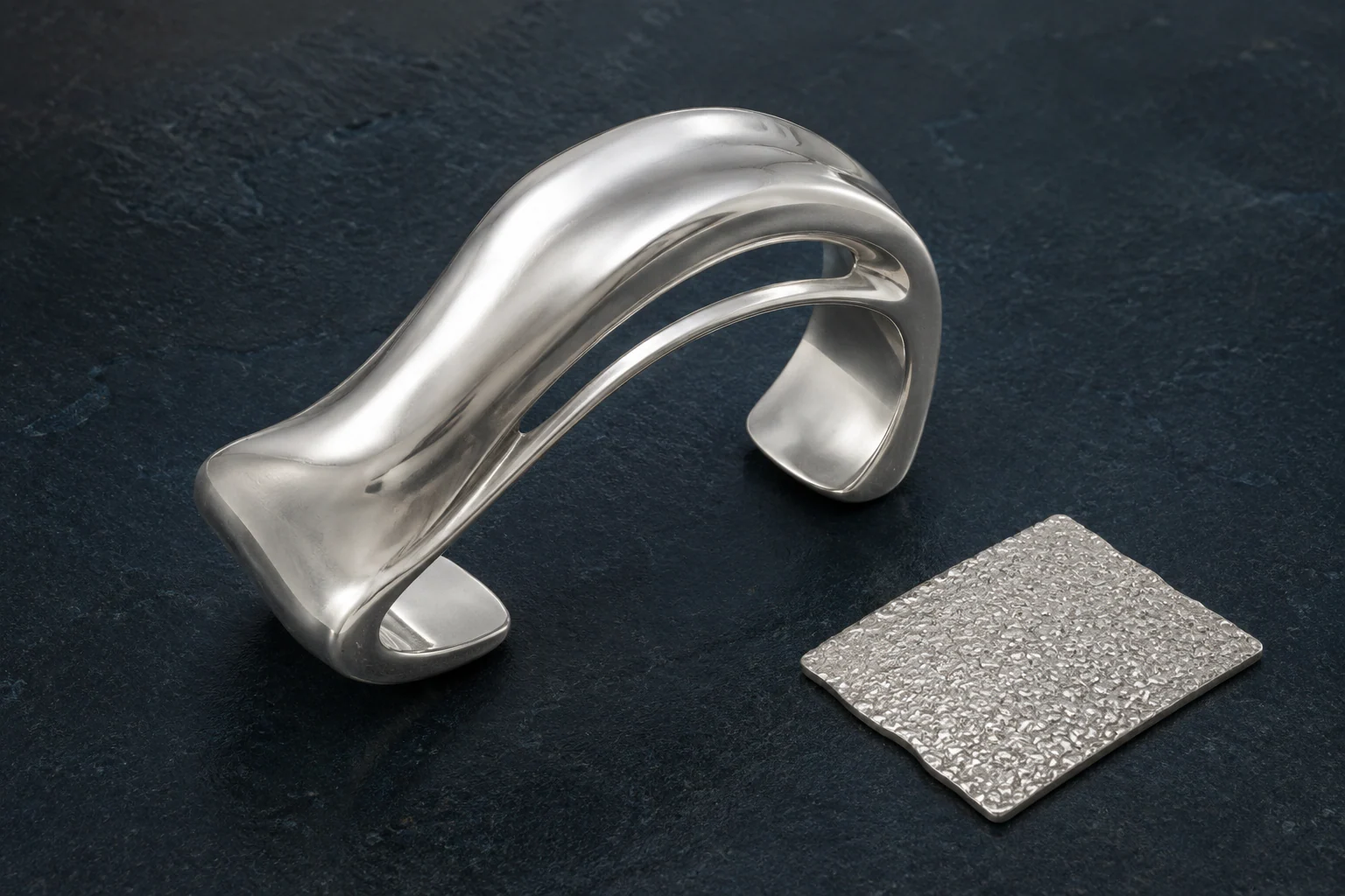
\nImagine two silver pieces. The first is a flat oval plate covered in granular pits. Its surface is active, but its overall silhouette is calm. The second is completely smooth yet rises, folds and opens into a channel before tapering back down. The second feels more fluid because the movement is structural rather than cosmetic.
\nThis does not mean textured metal is less interesting. It simply creates a different visual job. Texture breaks light into small events: tiny shadows, glints and interruptions. A liquid-looking form organizes light into longer paths. When both appear in one piece, the most successful design usually lets one lead. Otherwise the eye has too many signals competing for attention.
\n\nWhat “liquid” and “molten” actually describe
\nLiquid metal jewelry is a descriptive style term, not a promise that the finished piece remains liquid. The phrase usually points to metal shaped so that it appears to flow, pool or stretch. A liquid metal ring, for example, may use a swollen ridge, an uneven wrap or a soft fold to make a rigid band feel visually unstable.
\nThe related language of molten jewelry pushes the image slightly closer to heat and transformation. If you are asking what is a molten ring, the useful answer is simple: it is a ring whose visible form suggests metal that has softened, moved and then been arrested. A molten metal ring may have rounded edges, pooled volume or a contour that appears to have slumped rather than been drafted with a compass.
\nNone of these phrases tells you how a specific piece was manufactured. They describe appearance. Casting, fabrication, carving, forming and finishing can all produce very different results, so the product details still matter more than the poetic label.
\n\nRings reveal the difference quickly
\nRings are unusually good at exposing whether a fluid effect is structural because your hand keeps changing their angle. As you type, lift a glass or reach for a bag, the form rotates through light. A convincing design keeps producing coherent movement from several viewpoints instead of depending on one flattering photograph.
\nStart with thickness. A uniform band with a wavy top edge may read as a wave ring, but a stronger fluid form usually changes in more than one dimension. It may broaden across the finger, lift away, taper toward the palm side or open a pocket of negative space. Those shifts make the ring feel like a small volume in motion rather than a graphic line wrapped around the hand.
\nThen check clearance. Large ridges between fingers can become distracting in daily wear, while top-heavy forms may rotate depending on fit and weight distribution. Photographs can tell you about silhouette, but they cannot prove comfort. For any substantial ring, look for stated dimensions and material information, and treat wearability as something to confirm through use rather than assume.
\n\n
Why negative space makes metal feel more alive
\nOne of the most effective devices in fluid design is a true opening through the form. Negative space gives the eye a fixed point against which the surrounding metal can appear to bend, stretch or peel away.
\nA channel is especially useful. Instead of decorating a solid mass, the designer lets the metal split around air. The opening can widen and narrow, making the surrounding metal feel pulled by an invisible current. On a cuff, this can create more visual lightness than simply making the whole piece thinner.
\nNegative space also helps prevent a sculptural piece from becoming visually blunt. A large polished surface can read as heavy even when the physical piece is not. A deliberate opening introduces interruption and gives nearby skin, fabric or background a role in the composition.
\n\nOrganic shape jewelry is not the same as random shape
\nOrganic shape jewelry often borrows the logic of things that grow, erode, fold or accumulate, but good organic form is still edited. Nature is irregular; design is selective.
\nThe important question is whether the irregularity has rhythm. Does one curve lead into the next? Does a thick section resolve into a thinner one? Is there a reason your eye stops at one edge and continues around another? When every bump has equal emphasis, the piece can feel merely lumpy. When variation is paced, the form feels intentional.
\nThis is where fluid metal jewelry can become surprisingly restrained. It does not need to be a giant blob or a theatrical drip. A single controlled fold on a cuff can communicate more movement than ten decorative waves. The visual sophistication often comes from deciding where motion stops.
\n\nScale changes the mood
\nFluid forms behave differently at different body scales. A small earring can use one bright swell and a narrow taper; the same gesture enlarged into a cuff may become architectural. A ring can feel intimate because the movement is contained around a finger, while a collar or broad bracelet can read as a piece of wearable sculpture before it reads as accessory.
\nThis is why proportion matters more than trend labels. A glossy silver curve that feels playful at 15 millimetres can become severe at 60. A broad soft edge can look futuristic against a bare wrist but almost antique against ornate fabric. The form does not exist in isolation; clothing and anatomy change its visual weight.
\n\nHow to style fluid metal jewelry without overexplaining it
\nIf you are wondering how to style fluid metal jewelry, begin with contrast rather than matching. Let the jewelry supply the movement and let the clothes supply the structure.
\n- \n
- Against tailoring: a smooth asymmetrical cuff or ring interrupts a straight sleeve, sharp lapel or clean trouser line without needing additional ornament. \n
- Against soft knits: choose a piece with a clearer edge and fewer tiny surface effects so it does not disappear into the fabric texture. \n
- With evening black: polished metal can do the work of a bright accent. One broad reflective form is often stronger than several similarly glossy pieces. \n
- With color: treat silver or pale metal as a moving highlight rather than a neutral afterthought. Saturated blue, oxblood, rust, charcoal and deep green can make the reflections feel sharper. \n
The easiest mistake is repetition. A wave-shaped ring, dripping earrings, a melted pendant and a liquid cuff worn together can turn one good idea into a costume vocabulary. If one piece already has a forceful silhouette, keep the rest quieter or change the type of contrast entirely.
\n\n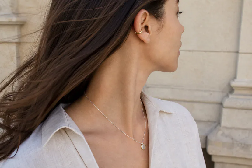
How to judge a fluid piece from photographs
\nOnline images are useful, but only if you know what to inspect. First, look for more than one angle. A piece that seems beautifully fluid from the front may reveal a conventional flat back or an awkward protrusion from the side. That is not automatically a flaw, but it changes how the piece will behave visually.
\nSecond, distinguish highlight from edge. Very reflective metal can create bright streaks that make a simple piece look more sculptural than it really is. Trace the actual outline with your eye. If the silhouette barely changes, the drama may come mostly from polish.
\nThird, look for scale cues. On-body images, dimensions and clear views of openings or closures are more useful than isolated glamour shots. For rings and cuffs, pay attention to the relationship between the sculptural volume and the spaces around fingers or wrist. For earrings, look at where the piece appears to attach and how far mass extends from the ear.
\nFinally, separate aesthetic judgment from practical claims. An image can show a rounded edge; it cannot prove comfort. It can show a polished finish; it cannot tell you how that finish will change under your particular pattern of wear.
\n\nCare for the reflection as well as the form
\nFluid jewelry often depends heavily on controlled reflection, which means surface condition affects the design more visibly than it might on a heavily textured piece. Fine scratches, residue and tarnish can alter the way highlights travel across a broad polished fold.
\nGeneral jewelry-care guidance from GIA emphasizes using care methods appropriate to the material and construction, and avoiding assumptions that one cleaning method suits every piece. Store jewelry so hard surfaces do not scrape against one another, and follow the maker’s current care instructions for the exact metal, finish and any stones or coatings involved.
\nFor sculptural pieces, storage also protects geometry. Do not force an open cuff into a space that bends it or stack heavy items on top of thin projecting areas. The goal is not to keep jewelry looking untouched forever; it is to avoid damage that changes the intended form.
\n\nA quick visual test
\n- \n
- Ignore the polish and look only at the silhouette. Does it still move? \n
- Look for changing thickness rather than repeated surface pattern. \n
- Find the negative space. Does it clarify the flow or feel accidental? \n
- Check the form from side and three-quarter views, not just straight on. \n
- Compare the jewelry’s scale with the body zone where it is worn. \n
- Read material, dimension, closure and care details separately from the style description. \n
That test helps distinguish a genuinely sculptural fluid form from a piece that simply has a rough, hammered or rippled finish. Both can be beautiful. They are just solving different visual problems.
\n\nRead next
\n- \n
- Explore sculptural jewelry \n
- Compare textured metal jewelry \n
- See wearable art jewelry \n
- Browse the current jewelry edit \n