2026 Spring Color Trends: An Aesthetic Guide From Cloud Dancer to Statement Palettes
We treat color the way galleries treat light: not decoration, but direction. The 2026 spring color trends arriving across runways, trend reports, and the endless moodboard-industrial complex aren’t asking us to “pick a favorite.” They’re asking us to choose a room—quiet or electric, translucent or lacquered—and step into it with intention. Below, we decode the season’s key hues (from Cloud Dancer to Plum Noir) and translate them into wearable, modular moves for clothes, nails, and accessories—because a palette should be actionable, not aspirational.
Introduction: why color is the core of spring aesthetics
Spring style can pretend it’s about silhouettes, but it’s usually about atmosphere. Color does the atmospheric work: it softens, sharpens, cools, warms, and (when handled well) makes the simplest outfit feel like it has an inner architecture.
At Switchroom, we’re biased toward pieces that behave like portable installations: small objects that alter the space around you without demanding you become someone else. Color is the fastest way to do that—especially when you treat it like spatial design. Think in planes (base), punctuations (accents), and anchors (depth). The 2026 palette is unusually good for this because it gives us a soft field (Cloud Dancer), a calm chroma (Cool Blue), a kinetic highlighter (Chartreuse), a ripe flare (Persimmon), and two deep “weight” shades (Jade and Plum Noir).
2026 spring color trends overview: Cloud Dancer to statement palettes
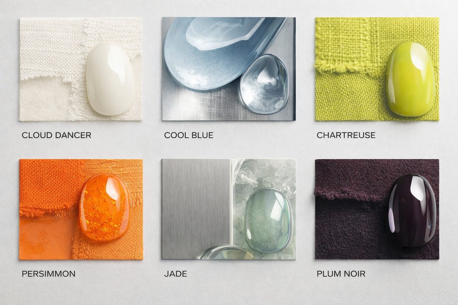
Let’s name what we’re seeing, and then talk about how to actually wear it. Two public-facing trend signals show up again and again in coverage: Pantone’s Cloud Dancer (a soft off-white) and Pinterest’s 2026 palette (Cool Blue, Persimmon, Jade, Plum Noir, Wasabi). We’re treating “Wasabi” as the same yellow-green family most fashion editors call chartreuse—because the styling behavior is identical: a bright, acidic accent that makes neutrals look deliberate.
Cloud Dancer (soft off-white): the negative-space base
Cloud Dancer is Pantone’s Color of the Year for 2026, described in mainstream coverage as an off-white rather than a sharp, clinical white. If you want receipts, read Forbes’ summary of Pantone’s Cloud Dancer announcement, and Smithsonian Magazine’s framing of Cloud Dancer as a “blank canvas”.
Our read: Cloud Dancer is not “boring.” It’s the field color that lets everything else read as choice. In spatial terms, it’s the wall paint that makes the artwork pop. In wardrobe terms, it’s the moment where you stop over-explaining yourself.
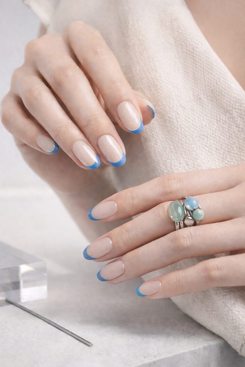
Cool Blue: calm clarity (and the “new neutral” behavior)
Cool Blue is being positioned editorially as a neutral-adjacent shade for 2026—less precious than pastel, less corporate than navy. Marie Claire calls Cool Blue a 2026 neutral trend—and we agree with the styling logic even when we don’t agree with the shopping links.
Our read: Cool Blue acts like air-conditioning for an outfit. It lowers the temperature, adds distance, and makes high-chroma accents look smarter.
Chartreuse (Wasabi-leaning yellow-green): the kinetic accent
Whether you call it chartreuse, wasabi, or “why does my outfit suddenly look expensive,” the point is the same: this yellow-green is the season’s punctuation mark. It’s also not our invention—Who What Wear flags chartreuse as a runway-forward shade.
Our read: Chartreuse is a lighting effect masquerading as a color. Use it like you’d use neon tape in an installation: sparingly, precisely, and with intent.
Persimmon: ripe warmth, not sugary brightness
Persimmon is warm, but it’s not childish. It’s the difference between a traffic cone and a glazed fruit. Pinterest’s 2026 palette recaps across multiple outlets list Persimmon as a headline shade (for example, ELLE Decor’s overview of the Pinterest Palette 2026).
Our read: Persimmon is warmth with backbone. It looks best when it’s allowed to be small and confident: a nail, a charm, a lining, a single sculptural element.
Jade: depth you can wear in daylight
Green has been cycling for a while; Jade is the version that doesn’t beg for attention. It holds it. As a trend signal, it appears in the Pinterest palette recaps alongside Persimmon, Cool Blue, and Plum Noir (again, ELLE Decor’s palette recap is a clean reference point).
Our read: Jade is the season’s “serious color” that still looks alive. It’s especially strong in accessories because it reads like a material (stone, glass, glaze) even when it’s pigment.
Plum Noir: near-black with a secret
Plum Noir is not gothic black. It’s black with a bruise of purple—subtle, dimensional, and very good at making everything else look intentional. Pinterest’s 2026 palette includes Plum Noir as a headline shade (see ELLE Decor’s recap of Pinterest’s 2026 colors).
Our read: Plum Noir is the best “anchor” shade of the set. It adds weight without looking like you gave up.
Color & contemporary aesthetics: what these shades communicate
Color meanings are not universal truths. They’re social agreements with personal exceptions. But we can still talk about what these shades tend to do in contemporary styling—especially when you think like a curator: what’s the exhibition text, what’s the lighting, what’s the pace of the room?
We also like the museum framing that jewelry is an art form that “activates” the body—language echoed in institutional coverage like The Met’s press materials for “Jewelry: The Body Transformed”. That idea matters for color: a shade on a wall is one thing; a shade moving with you is another. Wearable color has timing.
Cloud Dancer: silence, edited
Cloud Dancer reads as restraint. It’s the clean page before the poem, not the blank stare after the conversation. A Cloud Dancer base also makes materials legible: resin looks like resin, metal looks like metal, and we can stop pretending everything is “luxury” because it’s beige.
Cool Blue: distance, intelligence, breath
Cool Blue gives shape to calm. It’s especially useful when you want an outfit to feel composed without feeling “occasion-wear.” In our spatial-poetics language, Cool Blue is a window room: light comes in, you can think, nothing is sticky.
Chartreuse: electricity, interruption
Chartreuse is a deliberate interruption. It reads like an editorial highlighter: this is the line we’re underlining. It’s powerful because it’s difficult. If it feels risky, that’s the point—just keep the dose small enough that you stay in control.
Persimmon: appetite, warmth, momentum
Persimmon communicates warmth without softness. It’s social, but not naive. For accessories, it’s a beautiful bridge between metal hardware (cold) and skin (warm) without leaning too “sunset.”
Jade: grounded glow
Jade feels like depth you can still move in. It’s excellent when you want color to feel like a material choice rather than a mood swing. (Which is a polite way of saying: it doesn’t look like you bought it because an algorithm told you to.)
Plum Noir: nocturne, authority, softness at the edge
Plum Noir is for when you want darkness without severity. It’s also the easiest way to make brights look adult: put Persimmon next to Plum Noir and it stops being “cute.” Put Chartreuse next to Plum Noir and it becomes graphic.
If you want the longer version of this (with mood references, art cues, and a few “why this works” diagrams), we built a companion piece on the emotional aesthetics behind color.
Practical styling tips: fashion, nails, and accessories (the portable-installation method)
Here’s our working method for translating spring 2026 color palette trends into outfits you’ll actually wear: build a base field, add a punctuation, choose an anchor. It’s essentially exhibition design—but on your body.
First, pick your base (Cloud Dancer or Cool Blue)
- Cloud Dancer base: easiest route to “intentional minimalism.” The trick is texture—matte knit + glossy nail, brushed metal + translucent resin.
- Cool Blue base: easiest route to “quietly sharp.” Keep your neutrals cooler (grey, charcoal, blue-leaning off-white) so it doesn’t turn preppy.
Accessory move: when your base is quiet, your accessory can be sculptural without feeling heavy. A brooch becomes a small sculpture; a bag charm becomes a moving point of view.
Then, choose one accent (Chartreuse or Persimmon)
Accents are where most people overdo it. The easiest way to keep it elegant: cap your accent to one object category.
- Accent on nails: a single Persimmon nail, a Chartreuse micro-French, or a thin line detail. The outfit can stay calm.
- Accent on accessories: one small charm or brooch element. Keep your nails neutral (Cloud Dancer gloss or sheer Cool Blue wash).
- Accent on clothing: one piece only (a top, a scarf, a sock situation). Accessories become quieter, more structural.
Finally, anchor with depth (Jade or Plum Noir)
Anchors stop a palette from floating away. Jade and Plum Noir do this without making spring feel like autumn cosplay.
- Jade anchor: best when you want “alive” depth—especially good with Cloud Dancer bases.
- Plum Noir anchor: best when you want “graphic” depth—especially good when Chartreuse is involved.
Accessory move: anchors are perfect for hardware: clasps, chains, and modular connectors. A dark connector makes bright modules look curated, not chaotic.
Our favorite Spring 2026 color formulas (steal these)
We’re not precious about formulas. They’re scaffolding. Here are combinations that reliably work across clothes, nails, and sculptural accessories:
- Gallery White + Blue Draft: Cloud Dancer + Cool Blue + a pin-drop of Plum Noir. Clean, architectural, slightly aloof (in a good way).
- Fruit + Ink: Persimmon + Plum Noir + Cloud Dancer. Warmth, but edited. Great for a single statement charm with a dark connector.
- Green Room: Jade + Cloud Dancer + brushed metal. Looks like a material choice, not a trend chase.
- Acid Line: Chartreuse + Cool Blue + Plum Noir. Graphic, modern, best in small areas (nail linework, enamel detail, bag charm accent).
- Soft Field, Sharp Point: Cloud Dancer + anything bright, but only once. Choose your one bright moment and let it be enough.
For more outfit-level combinations and “what to do when everything clashes” fixes, keep our companion open in another tab: our color-trends styling tips companion.
2026 seasonal color guide for nails and accessories (clean, clear, non-weird)
We love nails because they’re a small-format canvas: you can try a high-voltage color without committing your entire wardrobe to it. But we also keep the boundaries crisp. Nail products are cosmetics, and we won’t pretend they’re anything else; the FDA’s nail care products page is a useful baseline for why claims matter. And for practical handling realities (ventilation, exposure, hygiene), OSHA’s nail salon resources are straightforward: see their notes on chemical hazards and biological hazards.
How we translate 2026 spring color trends into nail looks (without overcommitting)
- Cloud Dancer nails: sheer off-white gloss, or a soft milky finish. If you’re doing sculptural jewelry that day, this is the cleanest pairing.
- Cool Blue nails: a translucent wash reads modern; a crisp opaque reads graphic. If your outfit is Cloud Dancer-heavy, Cool Blue becomes your “one color.”
- Chartreuse detail: micro-French tips, a single line, a dot at the cuticle. It’s a design gesture, not a full paint job.
- Persimmon pop: one nail as a punctuation mark, or a tiny negative-space flame shape if you like a little drama.
- Jade / Plum Noir: perfect for depth accents—think half-moon shapes or a single solid nail to anchor a lighter set.
2026 colour trend moodboard nails: three quick “set” ideas
- Blueprint Minimal: Cloud Dancer base + Cool Blue linework + one Plum Noir nail.
- Ripe Accent: Cloud Dancer base + one Persimmon nail + tiny Jade dot details.
- Acid Geometry: Cool Blue base + Chartreuse micro-French + Plum Noir half-moon.
Hygiene note (not a scare tactic): If something touches your skin often, it deserves basic respect: clean hands, clean surfaces, and a plan. We keep a dedicated reference on jewelry hygiene and trust because maintenance is part of sustainability—and part of consent with your own body.
Accessories: best colors for spring jewellery 2026 (small object, big effect)
Accessories are where these colors get interesting, because they sit at the intersection of pigment and material. In museum contexts, contemporary jewelry is often discussed as concept + technique + unconventional material—see, for example, The Met’s “Jewelry: The Body Transformed” framing. That’s basically our world: small objects, high intention.
How to use spring colour trend combinations fashion accessories without looking like you lost a bet:
- Let Cloud Dancer be your “gallery wall.” Wear it in clothing or as a neutral nail, then hang one vivid object from it (a Persimmon charm, a Chartreuse enamel element).
- Use Cool Blue as a quiet connector. Cool Blue is surprisingly good at making warm metals look cleaner and greens look more “mineral.”
- Go small with Chartreuse. Think one modular piece, one bead, one edge. If it’s everywhere, it stops being design and starts being noise.
- Choose one deep anchor. Plum Noir hardware, or a Jade focal piece. Depth is what makes the palette feel adult.
Our favorite wearable-art move for 2026: a Cloud Dancer outfit + one sculptural accessory that carries both an accent (Persimmon/Chartreuse) and an anchor (Jade/Plum Noir). It reads like composition, not trend participation.
How to use 2026 color trends in styling when you want subtle, not loud
Subtle doesn’t mean colorless. It means edited. Try:
- Monochrome with one “wrong” detail: Cloud Dancer-on-Cloud Dancer, then one Chartreuse line (nail or charm). The tiny wrongness is the point.
- Cold-warm calibration: Cool Blue base + Persimmon accent. The contrast makes both feel sharper.
- Material-first color: choose a Jade that looks like glass or stone; choose a Plum Noir that looks like ink. When color feels like material, it stops feeling like a trend.
Transformative colour styling tips (our “switch rooms” method)
Our brand thesis is simple: you can change rooms—persona, mood, social temperature—without losing integrity. Color is the fastest switch, and it doesn’t require a new self. It requires a new arrangement.
Try these “room switches” using the same base outfit:
- The Quiet Room: Cloud Dancer base + brushed metal + sheer Cloud Dancer nails. One sculptural form, no bright accents.
- The Blueprint Room: Cool Blue base + Plum Noir anchor + minimal hardware. Add one precise geometric accessory.
- The Electric Room: Cloud Dancer base + Chartreuse accent + Plum Noir anchor. Keep shapes clean; let the color do the talking.
- The Ripe Room: Cloud Dancer base + Persimmon accent + Jade anchor. This is warmth with structure.
Conclusion: interpreting trends as personal language (with boundaries)
Trends are only useful when they become vocabulary. The 2026 spring color trends offer a clean grammar: negative space (Cloud Dancer), calm structure (Cool Blue), bright punctuation (Chartreuse, Persimmon), and deep anchors (Jade, Plum Noir). Use that grammar to write something that still sounds like you.
In 2026, the smartest palette isn’t the loudest one. It’s the one you can repeat—across seasons, across moods—because it’s built on clarity. A base. A punctuation. An anchor. Then we switch rooms.
FAQ: 2026 spring color trends
What are the key colors for Spring/Summer 2026?
Our headline set for Spring/Summer 2026 is Cloud Dancer (soft off-white), Cool Blue, Chartreuse (Wasabi-leaning yellow-green), Persimmon, Jade, and Plum Noir—built around quiet base + vivid accents + deep anchors.
How do I use 2026 spring color trends in accessories and nails?
Start with a base (Cloud Dancer or Cool Blue), then add one accent (Persimmon or Chartreuse) and one anchor (Jade or Plum Noir). In nails, keep the accent on a single nail or a thin line; in accessories, let the accent live in one sculptural piece.
Which colors feel most powerful in 2026 styling?
Plum Noir and Jade deliver the most depth and authority—especially when they appear in accessories (brooches, bag charms, modular pieces) where a small area can carry a lot of visual weight.
Is Cloud Dancer just “white,” and how do we wear it without looking flat?
Cloud Dancer is better understood as a soft off-white: treat it as negative space. Layer textures (matte + gloss), shift tones (warm ivory with cooler grey-white), and add one precise accent color so it reads intentional, not unfinished.
What’s a safe, practical way to approach nail trends (including press-ons)?
Use products as directed, keep tools and hands clean, and prioritize ventilation when using adhesives or removers. We don’t make medical claims; we focus on clear hygiene boundaries and product-handling transparency, aligned with FDA cosmetics guidance and OSHA nail-salon hazard overviews.
How do I make trend colors feel like “me” instead of a costume?
Pick one “room” you want to inhabit (quiet, electric, grounded, nocturnal). Keep everything else simple: repeat the color in two small places (nails + accessory, or accessory + shoe) and let the rest be a calm frame.